This is how I went about designing a website for my part time dog photography business. My aim and challenge were to strike a balance between visual aspect, discoverability of information and simplicity of the booking process. Also due to limited resources(time and money), I had to play all the roles involved in the design and development of the website. All this while not forgetting about the User-Centred approach and task-oriented design for the best possible mobile experience.
I started with analysis of competition to see what user experience is offered.
Speaking to family and friends I tried to find out what they expect from this type of websites.
Our conclusion was that the most crucial functions and easily discoverable information should be
• Area of operation
• Examples of work
• Transparent pricing and photoshot information
• Contact information
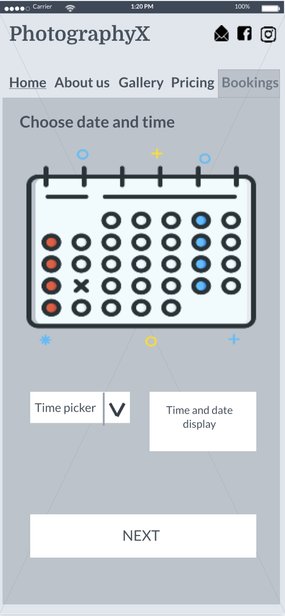
• Seamless booking experience
For MVP I’m not including online delivery of photos, printing service or accounts.
Throughout this project, I have tried to use the Design Thinking approach although user research, design evaluation and usability testing was limited to family and friends.
As anyone is a possible user of photography services it is hard to boil them down to a small number of personas so my aim was to design for a wide range of users.
Year on year we witness an increase of people accessing the internet on their mobiles rather than desktops and this fact was behind my decision to go with the mobile-first approach.
‘On the go’ use and high probability of older users means user journeys must be as seamless and intuitive as possible. During the whole project, I kept in my mind ‘don’t make the user think’ mantra.
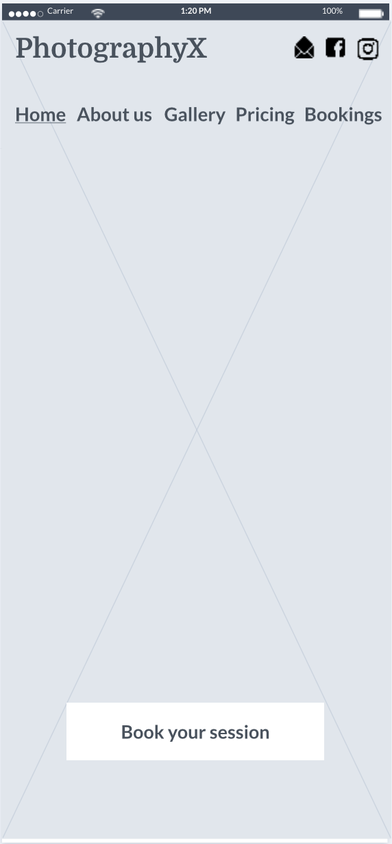
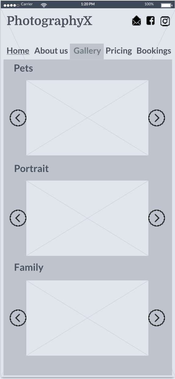
After deciding on the minimum viable functionality of the website and task analysis with a mobile-first approach in mind I created some Customer journey maps and wireframes.
With those in my hands, I conducted small user research.
Taking user feedback and using SCAMPER method(substitute, combine, adapt, modify, put to other use, eliminate, reverse) I have done changes to information architecture.
In the mobile version, the navigation bar looked crumped so I have moved ‘about us’ subpage content to lower part of the home page.
Than added visual cue(V) to improve the discoverability of that content. I have also enlarged social media icons for the mobile version to make it at least 44 pixels to make it touch-friendly.
Due to limited resources and no plans for use of mobile’s specific hardware(GPS, motion sensors etc.) I decided to go with a responsive design.
The time came to put my UI hat on. My tasks were to design a logo and try different colour schemes along with various typography.
During this stage, I paid attention to accessibility and W3C standards compliance.
There is nothing worst for the project than coming up with pretty designs that will have to be scrapped a few months down the line due to accessibility issues.
I came up with a shortlist and had to use the help of family and friends knowing that I probably owe them lots of money by now.
Below there are a few alternative designs that were not chosen.
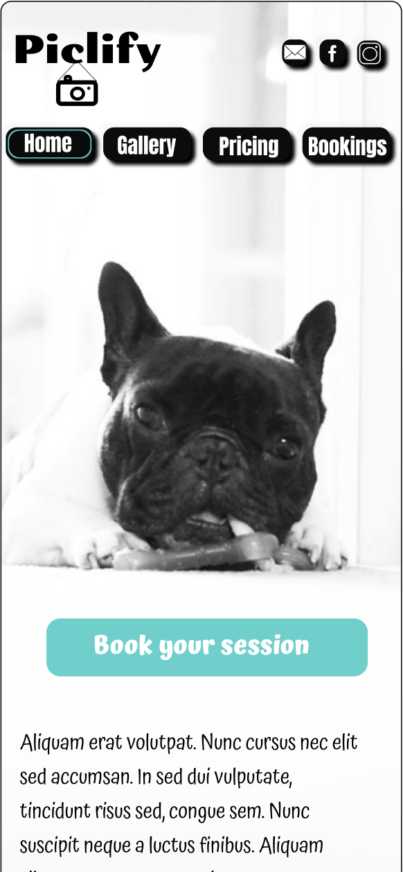
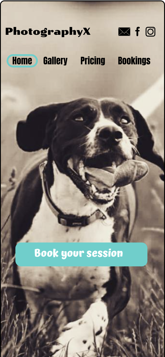
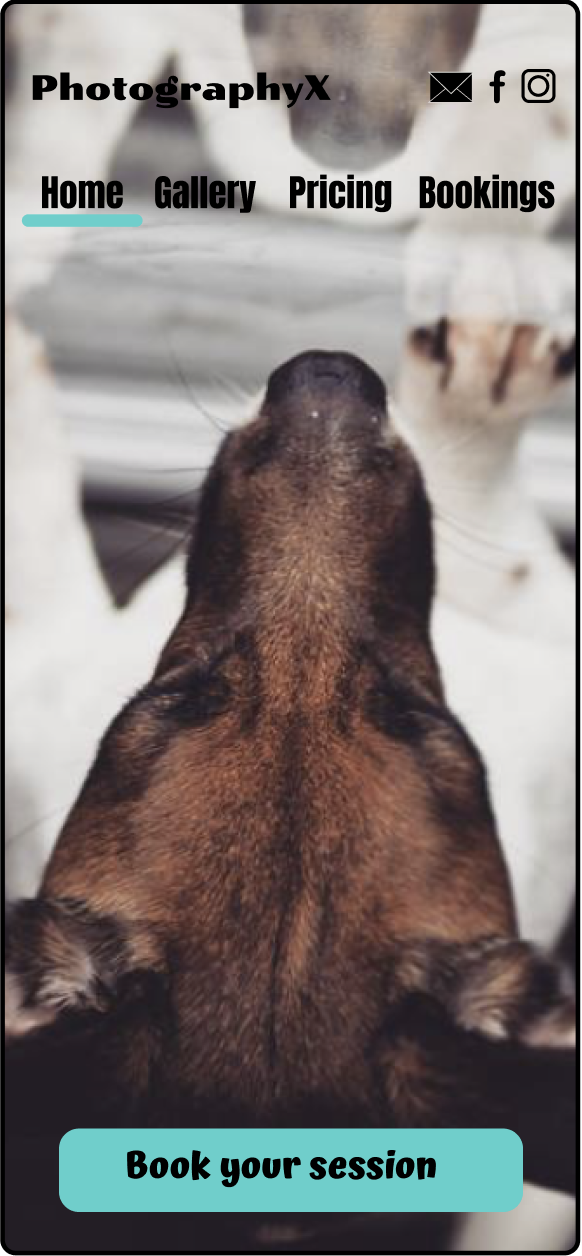
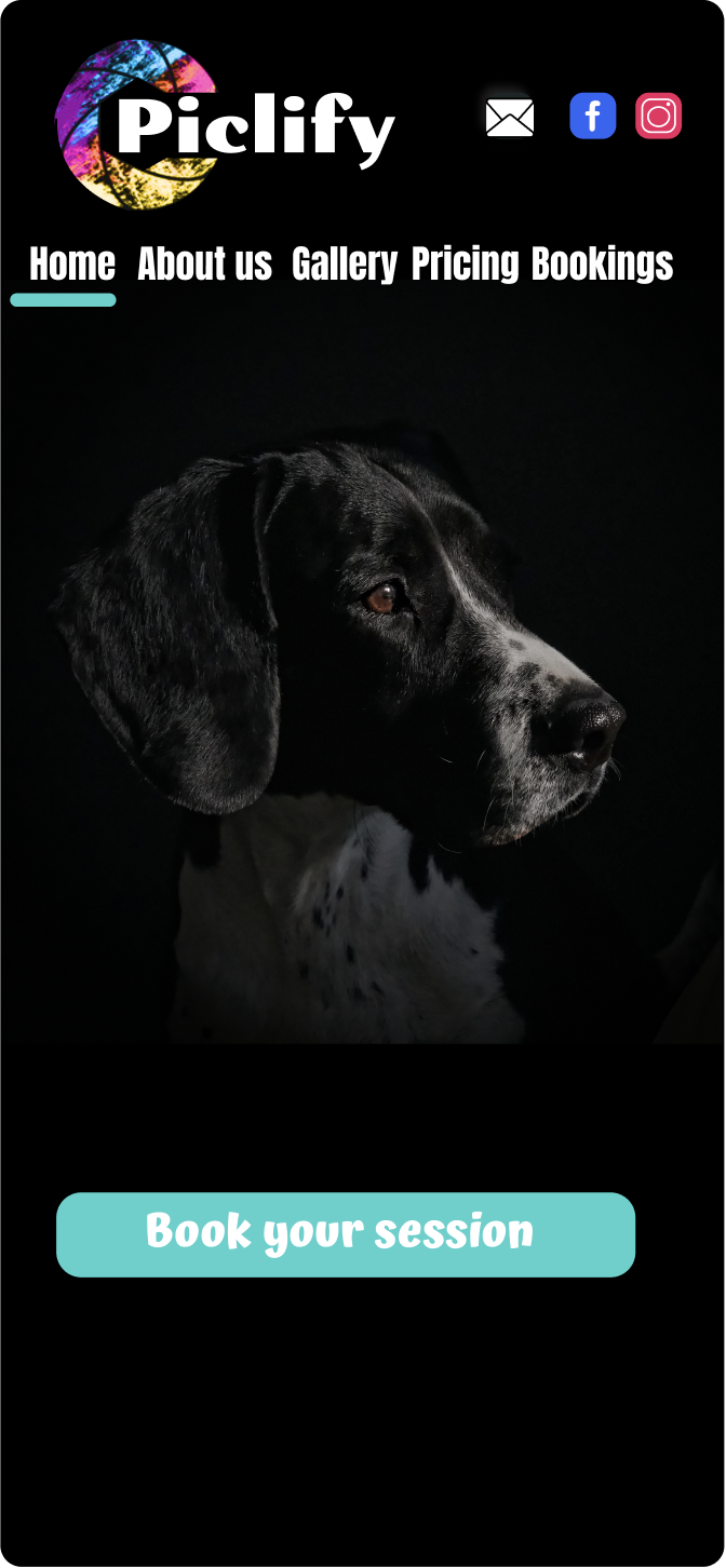
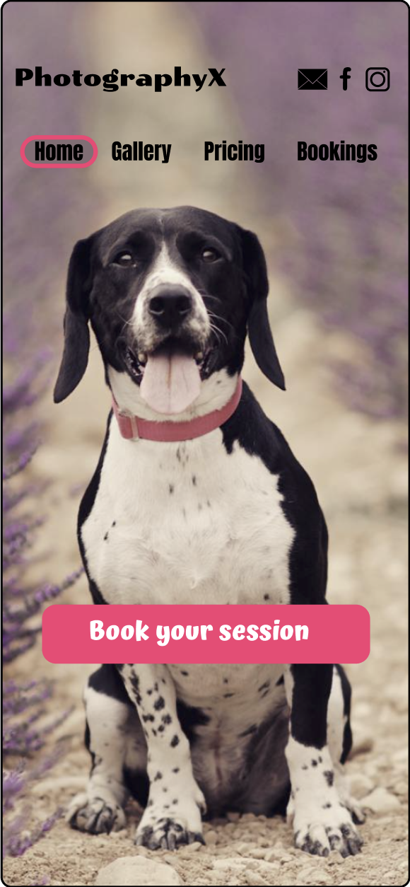
After a few iterations and refinements, I had a clear winner.
The final design is a mash-up of favourite elements resulting from this small reasearch.
Colours used:
Typography used: Diplomata, Anton and Atma.
At this point in my journey, I learned that despite using the responsive design I could have used a hamburger menu for a mobile version with the media query. But decided not to as there are only four tags in the navigation bar for MVP. When my website is live I plan to consider my options for ‘prints’ and following that also account/log in functionality. For mobile it will it would mean the hamburger menu and moving social links.
Using Figma I have connected all the pages into high fidelity prototype so I could test it with users. At this stage, I had a dilemma because Figma did not offer “jumping” to specific content placed lower on the home page. For purpose of having a clickable prototype, I had to create a pop up for the FAQs section. The very least I could do was to create a sticky exit button (X) and the possibility of exit by clicking outside the pop-up window. This way at least the user is returned to where they were before going to the FAQ section.
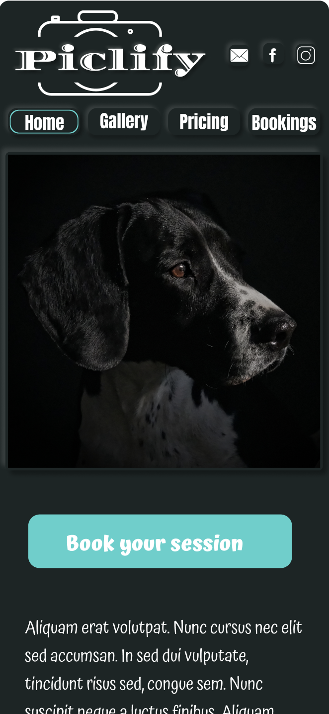
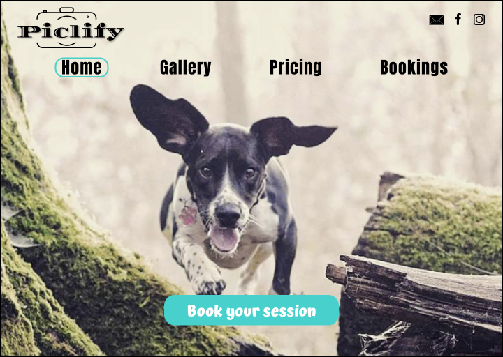
My high fidelity prototype
Overall I’m pleased with the outcome. I think I have achieved what I wanted from this project so far. My users thought that it is relatively easy to find the information they needed and the booking process is simple. 90% of the users were able to finish the booking within 2.5 minutes. They also like the look and feel of the site.
This project definitely took me out of my comfort zone as it was first of this kind to me. Before I even started I joined the Interaction Design Foundation and completed 3 UX/UI courses. Additionally, I have learnt Figma and Marvel software. Their great functions but also the limitations.
I have got to admit that the designs could be done in a shorter time but not only software has its faults. Another lesson learnt was that UX problems are not black and white and very often there has to be a compromise and choosing not ideal but just better design.
For me, this is only the beginning as I want to complete more courses and learn different technologies necessary for UX/UI.