The following is a short story about my efforts trying to design a mockup home page for job agency. The agency would specialise in bringing businesses and IT professionals together. My challenge was to design an uncluttered, intuitive and visually compelling home page. Throughout the project, I used Design Thinking approach.
As usual, I started by visiting other websites specialising in this sector.
Also conducted small user research with my friends. I was curious about the things they expected or disliked when visiting websites of this type.
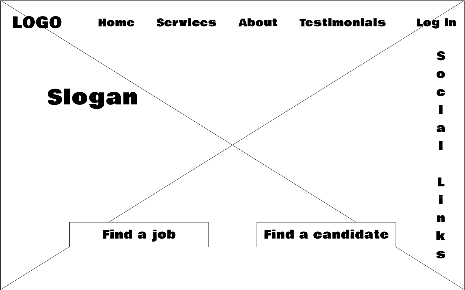
What I found out was that they preferred when the site was divided into two sections as it’s very unlikely the same visitor will be a potential employer and employee.
I came to the conclusion that user experience could be greatly improved if the content was displayed according to the type of visitor.
Examples:
• Visitor dependent search function
• Visitor dependent testimonies displayed
• Visitor dependent account space
• Etc.
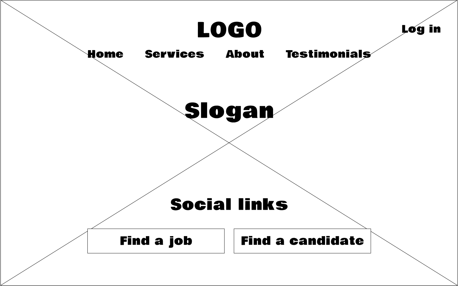
Having wireframes I was ready to ask my friends how they liked the functionality and layout.
Taking their feedback and having done some minor changes I had two sets of wireframes ready for the next stage. They differed only in the layout so was curious what both would look like after UI phase.
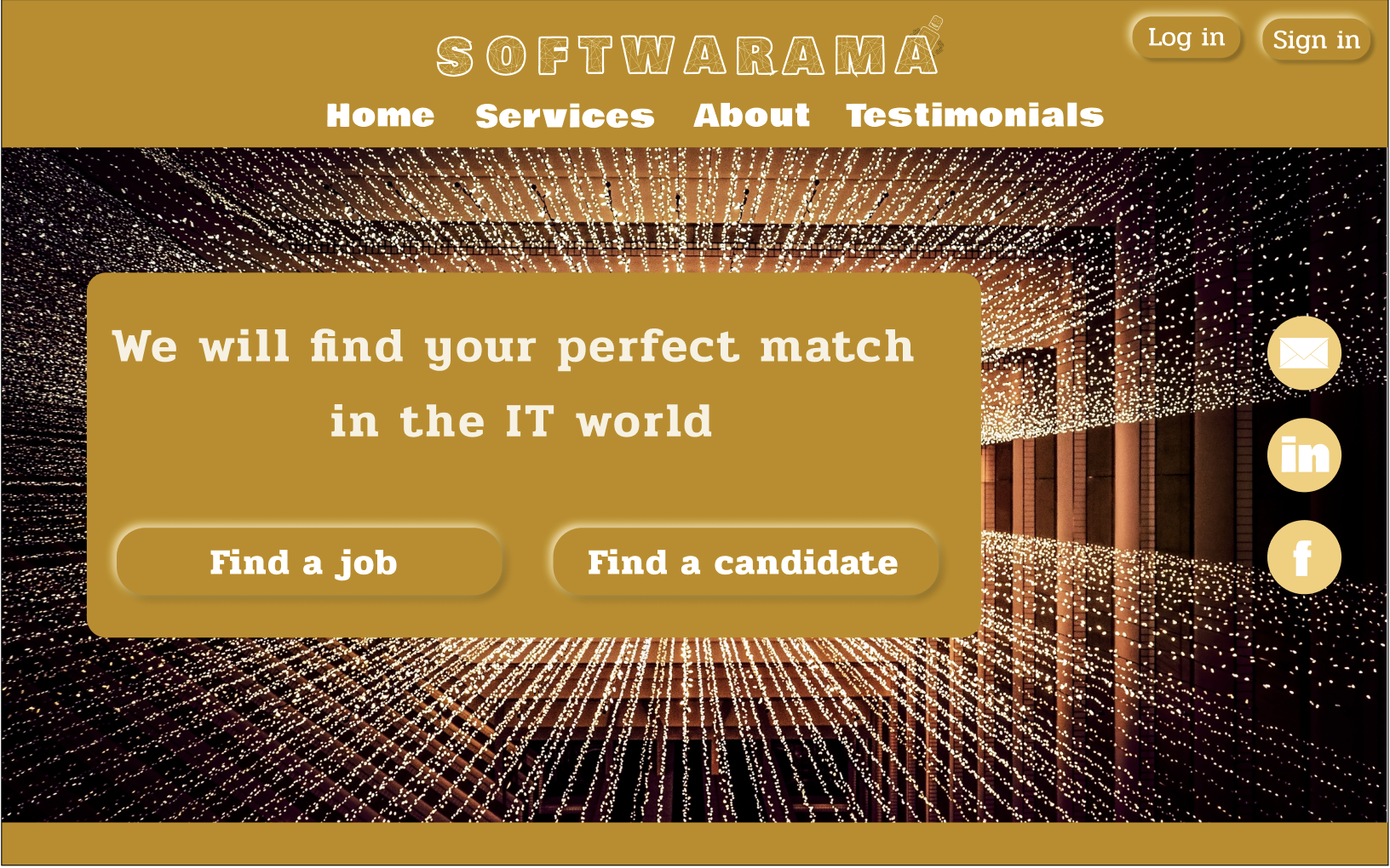
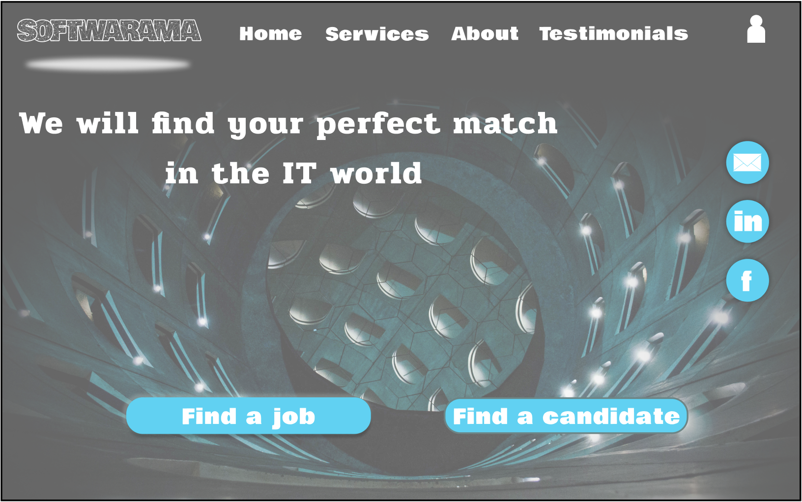
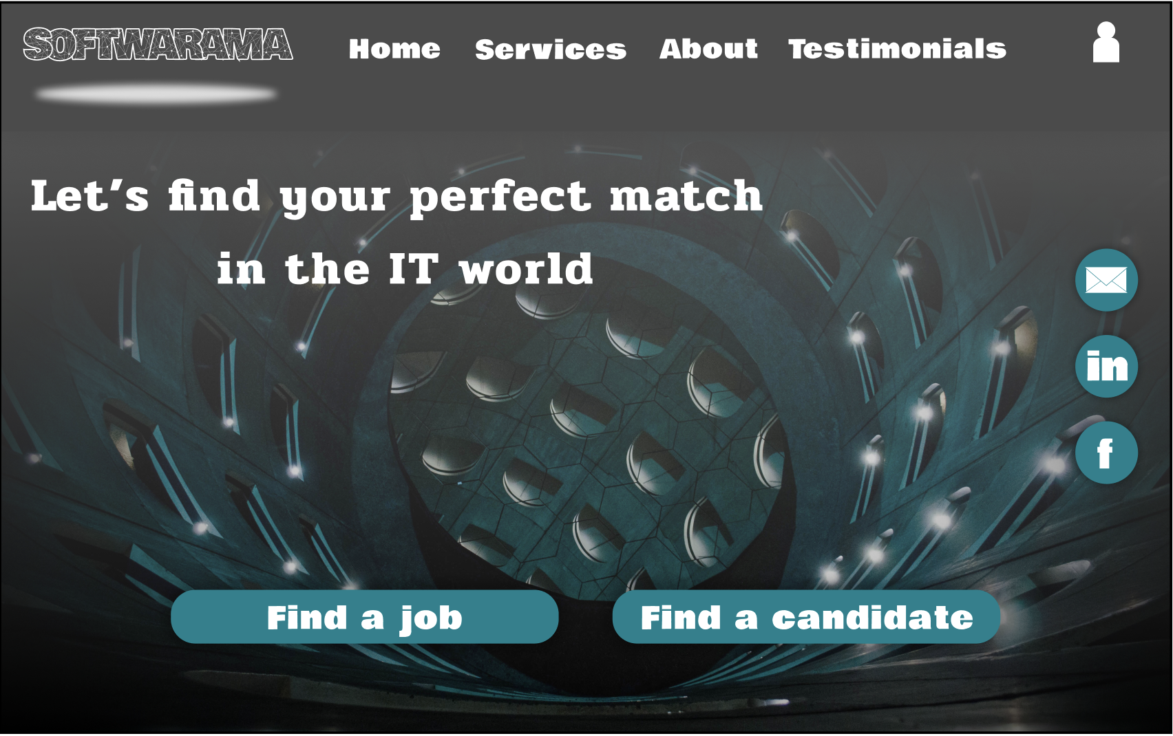
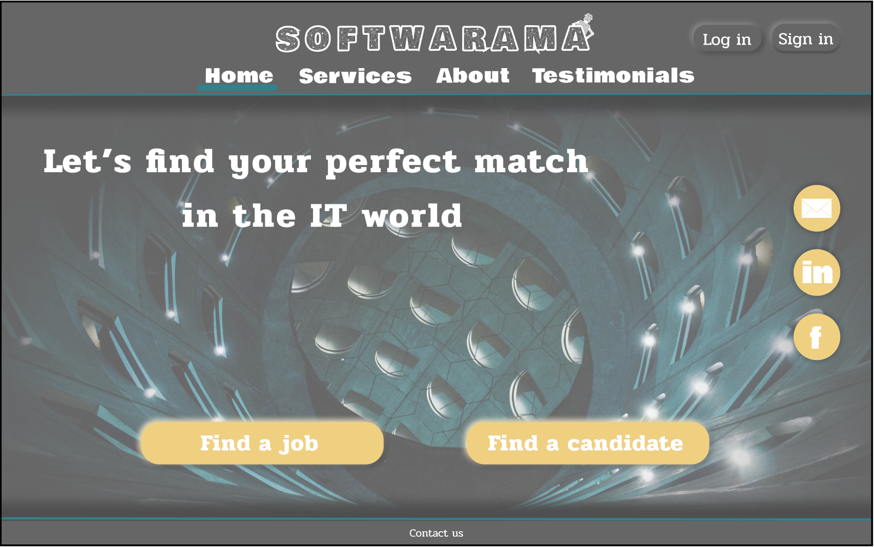
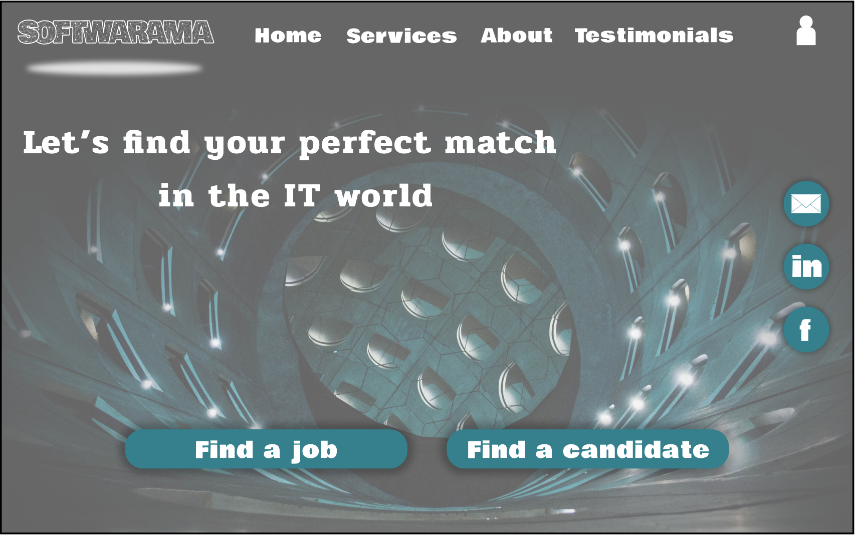
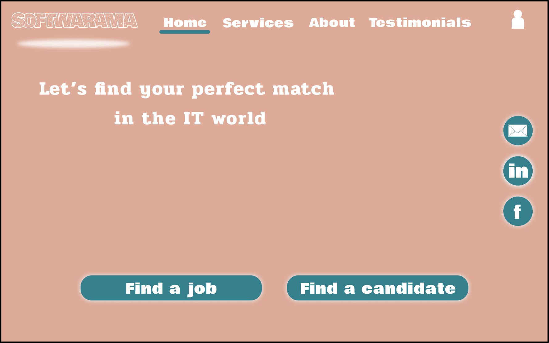
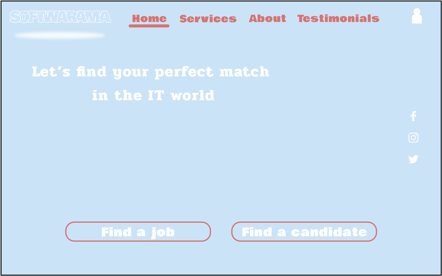
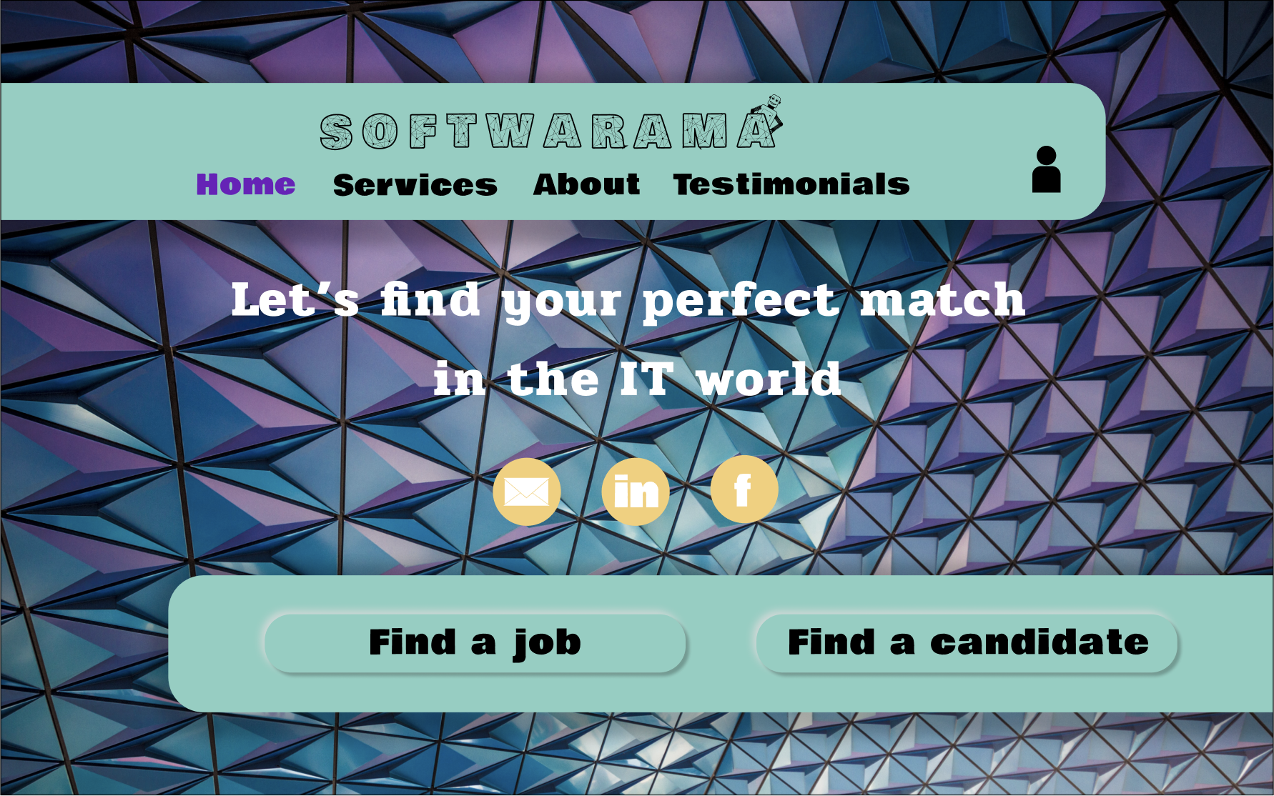
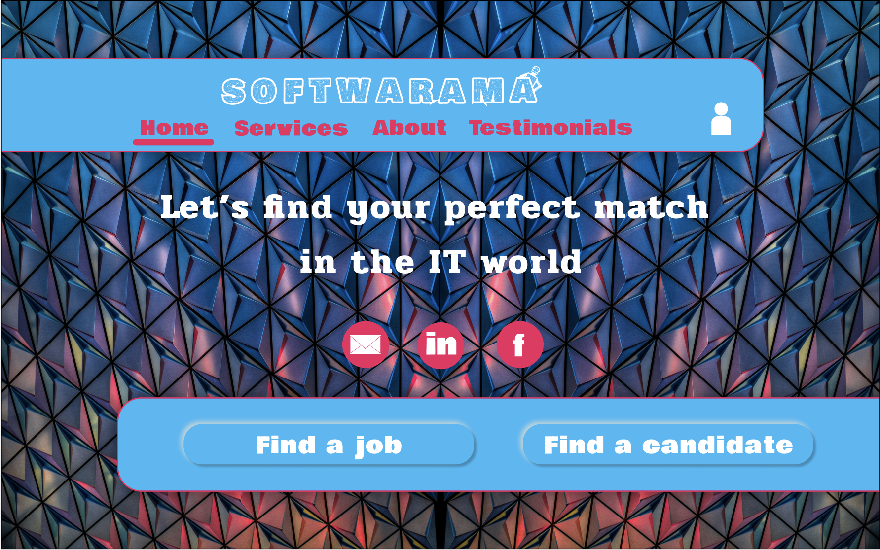
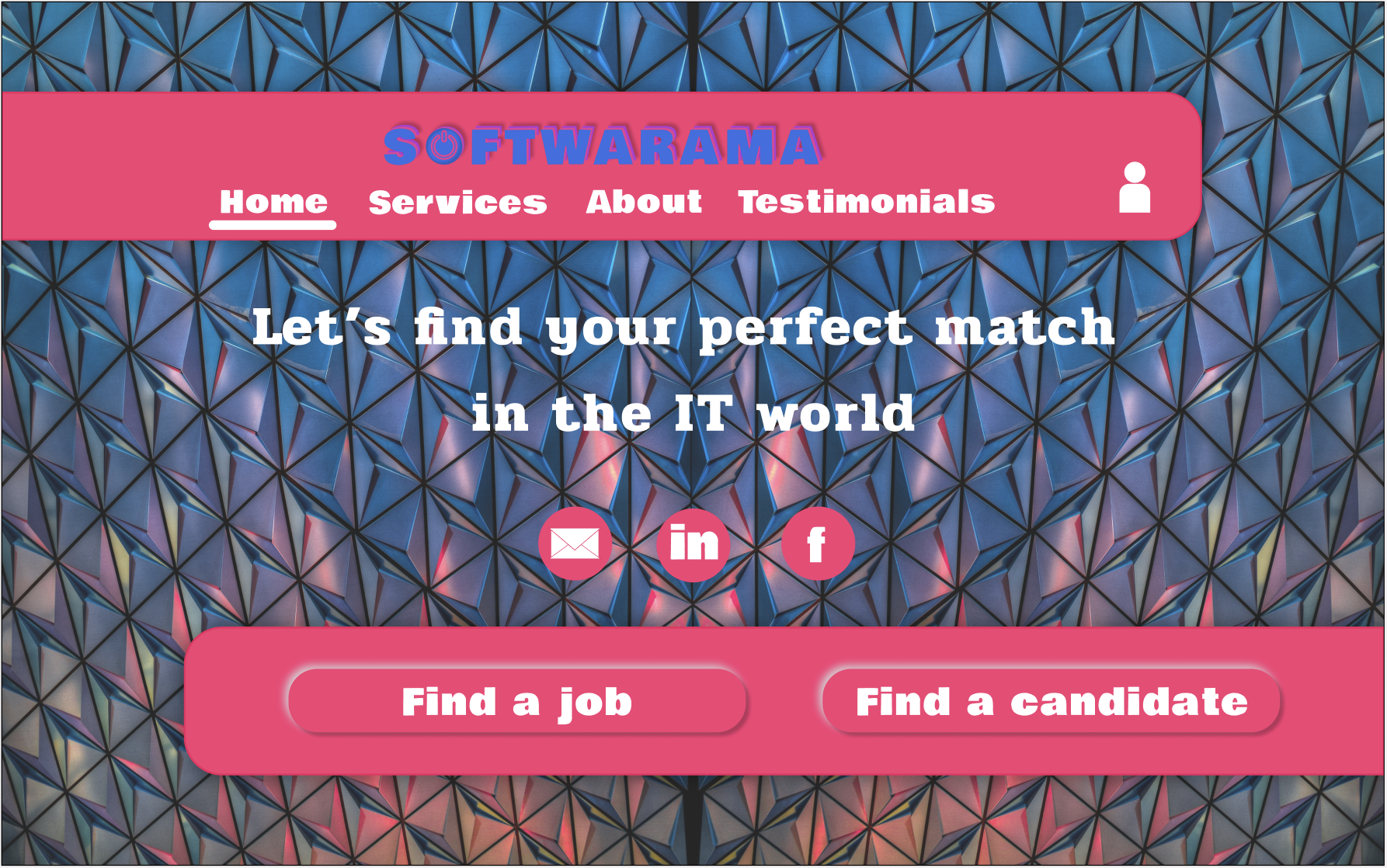
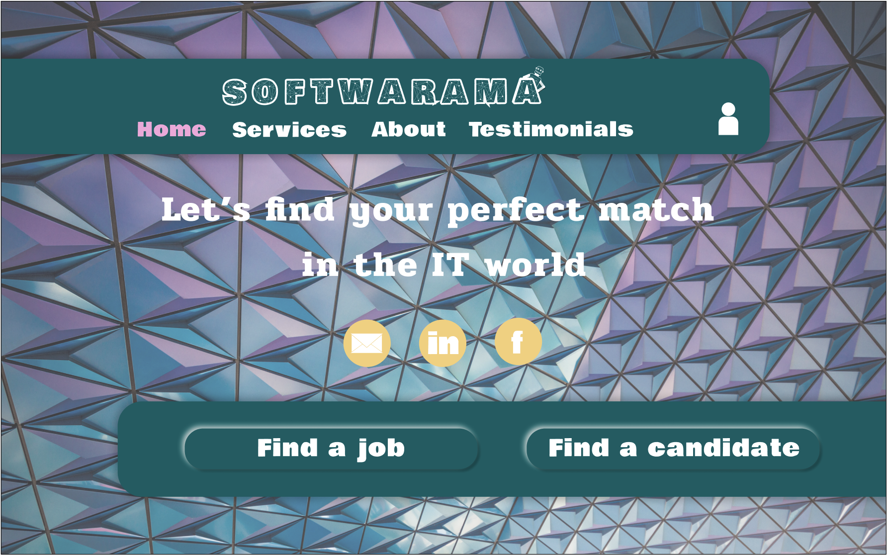
Examples of typography, logo designs and colour schemes.